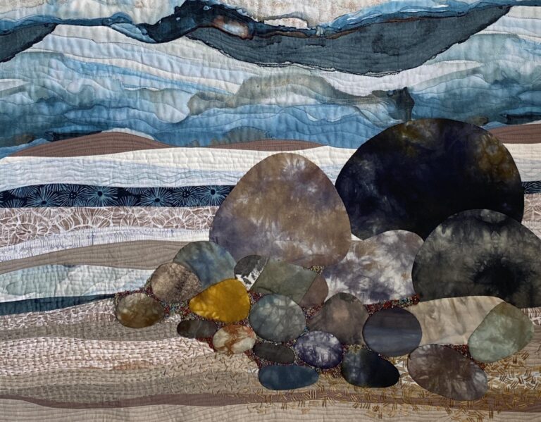
Composition in Art – The Rule of Thirds

I’ve been talking, creating videos and thinking a lot about composition in art. What it is. And why it is so important when creating.
A lot of research has been done in the past few months and I, myself, have learned a lot. So, you may ask, what is Composition?
Composition in art refers to the thoughtful arrangement and organization of visual elements within a piece, such as shapes, colours, lines, and textures, to create a cohesive and harmonious whole. It is the blueprint that guides the artist in placing these elements to create balance, emphasize focal points, and convey a particular mood or message. Composition is crucial because it influences how a viewer interacts with the artwork, directs their eye, and impacts their emotional response. A strong composition can make an artwork compelling and memorable, ensuring that the artist’s intention is clearly communicated and that the viewer remains engaged.
Ok, that’s great! Clear as mud … I get it, really, I do. There’s a lot to composition. And a lot more about good composition. One of the places to start – because we need to start somewhere, is to understand The Rule of Thirds. Have you heard of it?
The Rule of Thirds was first written down in 1797, when an author quoted English painter Sir Joshua Reynolds. In discussing the balance of light and dark in an artwork, Reynolds refers to the Rule of Thirds, discussing it as a more general principle of balance. It would later be transformed into the grid system we know today.
What it is: The Rule of Thirds is a compositional guideline that suggests dividing your canvas or image into nine equal parts by using two equally spaced horizontal lines and two equally spaced vertical lines. This creates a grid with four intersecting points. The idea is to place key elements of your composition along these lines or at their intersections (known as power points).
Why It Works: The Rule of Thirds helps to create more balanced and visually appealing compositions. Placing elements off-centre, along the grid lines, rather than directly in the centre, tends to lead to more dynamic and interesting artwork. This method also mirrors how our eyes naturally tend to view images, making it easier for viewers to engage with the artwork.
Photographers aren’t the only ones who use the Rule of Thirds. Long before the world’s first photographs, famous artists frequently employed the technique in order to achieve harmony and balance in their compositions. Let’s look at an example:

This early painting by Vermeer shows a use of the compositional trick in the manner in which the sleeping maid’s head lines up with the upper horizontal line. Interestingly, the top of the jug on the table matches the lower horizontal line, creating a pleasing distance between the foreground and background subject. Even the door cracked open has a compositional purpose. The door itself falls exactly on the right vertical line running through the painting. These choices, combined with Vermeer’s use of light and shadow, lend dramatic tension to this seemingly everyday scene. (From MyModernMet.com).
Let’s look at some photographs of landscapes and apply the rule of thirds. I took the one below in Willemstad on a beautiful warm day before crossing the bridge to get to the town. You can see that the area of interest is centred with lots of negative space above and below. Lots of sky and lots of water. What happens if I crop the image and remove some of the water?

Once that is done, the line falls on the buildings with the tallest element to the far right, away from the centre of the image. This will act as the focal point. There is still lots of negative space with the sky above the point of interest. I like this composition way better.

Let’s take a look at a magazine layout. What do you see? Notice how a composition made up of cool or warm colours with a touch of the opposite will always be strong. We have a room made up of cool colours in blues and light violet – and some neutrals – and all accent pieces are in warm colours and the majority of warm colour elements are placed in the centre section, giving balance to the room.

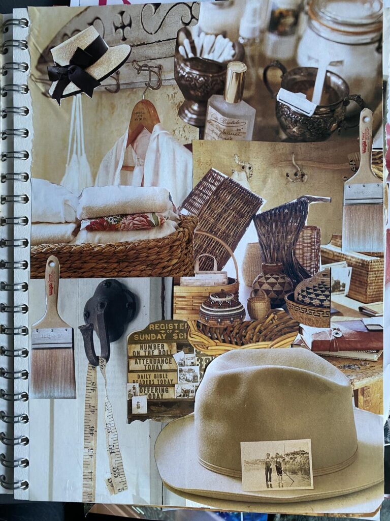
I’m using the rule of thirds on some of the magazine paper collages I made when I was exploring Shape and Form – Elements of Design. The shapes in this instance are almost evenly spaced diagonally across, falling on the diagonal power points.

If I move the elements, now the three vessels fall from left top to middle bottom left to top right, creating a sort of circular design for your eye to travel through the piece. The vertical strip of blue paper on the left falls on the vertical line and the three horizontal strips follow the top horizontal line. I think I like this one.

And a final exploration with the three shapes to the extreme left in a different composition using different coloured magazine papers. The shapes now fall along the left vertical line, leaving the rest of the composition more open. Once again, the horizontal strips of red paper follow the horizontal line towards the centre top and the vertical ones fall on the right vertical line. It’s a busy composition but I think it still works. I would move the top pot to the top of the line.

Do you have a favourite? I invite you to try this same exercise with images of your work or your own images. There’s a lot to be learned about our own work and our preferences when experimenting. The more experience you gain in placing important elements in a composition, the simpler, yet dynamic your pieces can be. Above all, have a good time doing it!
When taking photos with your camera or phone, turn the grid on as that’s going to help you with composition. As we are now using digital cameras and phones, it makes it simpler to take lots of photos of different compositions and then simply delete the ones you don’t like. Only keep the good ones to work from. That being said and done, keep the ones you don’t like in a separate folder to compare and learn from. Why don’t you like them? What do you see? Where are the central elements?
I hope you find this post useful. Leave a comment below and tell me your thoughts. Yes to more like this post?
Thanks for reading, until I write again, I hope you try the rule of thirds. Enjoy your explorations.
Ana
Discover more from Ana Buzzalino
Subscribe to get the latest posts sent to your email.


A fascinating subject broken down and illustrated making the Rule of Thirds easier to translate to our art work. Thank you for another thought provoking post.
Thank you Ana. I felt I really learned something from this post.